
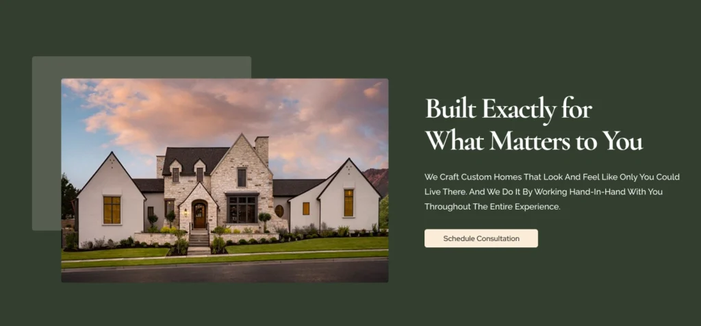
Use clear, focused headlines and images on your landing page that match the exact service your ad targets. This instantly reassures visitors they’re in the right place and boosts your chances of converting clicks into leads.
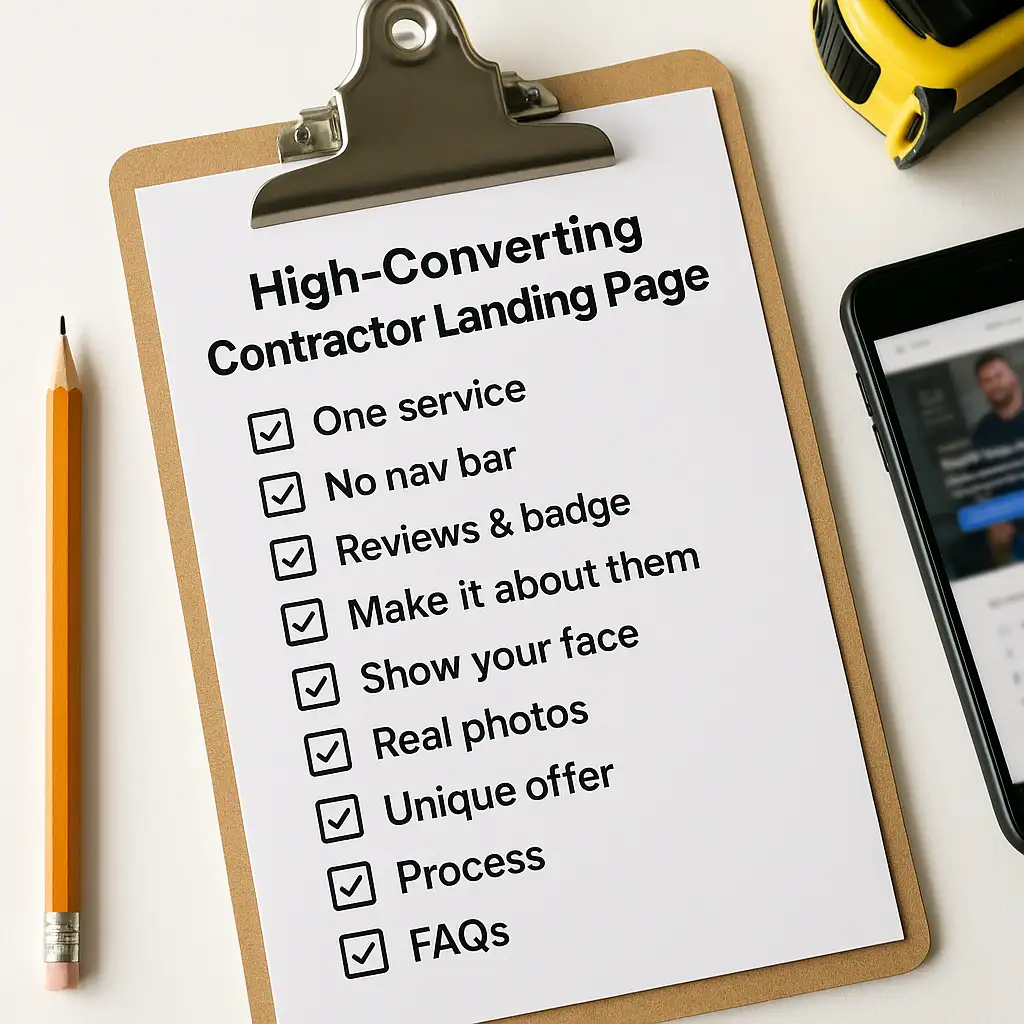
Contractor’s landing page guide for Google ads
What your landing page needs to convert clicks into real leads and stop wasting your ad spend.
- June 10, 2025
- 7 Min read
In This Article
If you’re running Google Ads for your contracting business and your phone isn’t ringing, it’s probably not the ads, it’s your landing page.
Even if your Google PPC campaign is dialed in, a weak landing page can kill your results. This post breaks down exactly what a high-converting contractor landing page looks like based on industry best practices from top marketing agencies like Hook Agency, Scorpion, and ourselves :).
don't use your homepage! focus on one service per landing page
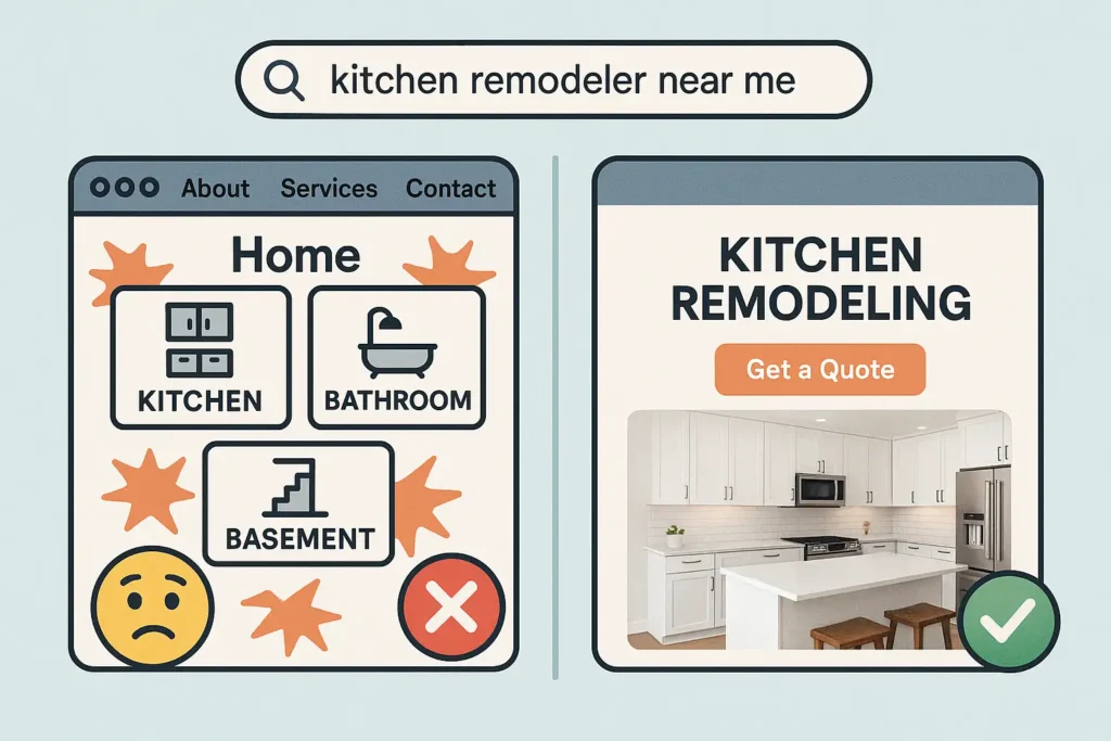
One of the biggest mistakes contractors make when running Google Ads is sending traffic to their homepage. It seems convenient, but it’s a conversion killer.
Imagine you googled “pizza near me,” click the link, and land on a website full of burgers, sushi, tacos, and pizza. It’s confusing because all you want is some pizza! But if the page you land on brings you straight to the pizza specials, you’re more likely to go try some.
Sending visitors to your homepage is the same.
Let’s say you offer kitchen remodeling, basement finishing, and bathroom renovations. If someone searches for “kitchen remodeler near me,” your ad should take them to a page only about kitchen remodeling. That’s what they searched for, that’s what they expect to see.
Your homepage usually has too many options, too many services, and no clear direction. It overwhelms and confuses visitors, and confused people don’t convert.
PRO TIP:
Cut the Clutter, Lose the Navigation Bar
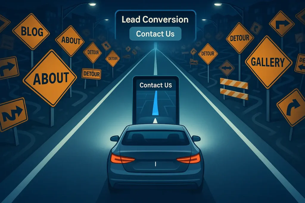
Think of your landing page like a GPS guiding a driver to a specific destination. If the GPS suddenly offers dozens of random detours and side roads, the driver gets distracted, confused, and might never reach where they intended to go.
That’s why high converting landing pages remove the navigation bar no detours, no distractions. Just one clear route: getting the visitor to contact you.
Removing menus and extra links on PPC landing pages keeps visitors focused on one simple action, filling out your form or making a call. Not wandering off to other pages like your blog or services overview.
If you want to show off your full website, consider redirecting visitors there only after they’ve completed a form. This way, you capture the lead first.
Make your landing page a straight highway to conversion, not a roundabout of options.
PRO TIP:
The only buttons on your landing page should lead visitors to contact you.
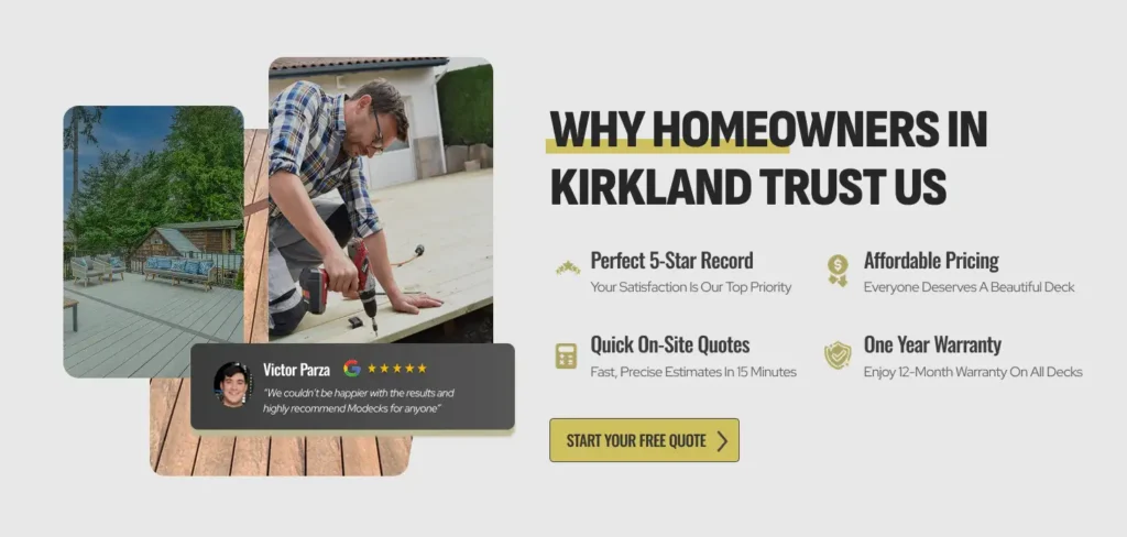
Build Trust Instantly with reviews & trust badges
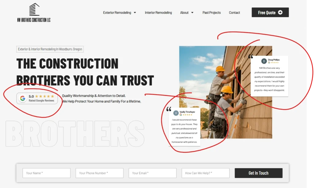
People want to know they’re hiring a reliable contractor before they take action. That’s why it’s crucial to showcase trust badges and customer reviews near the top of your landing page.
Studies show that only about 20% of website visitors scroll past the first screen of a page. If your reviews and trust signals are buried lower down, most visitors won’t see them at all. By putting these elements front and center, you instantly reassure potential customers that you’re trustworthy and experienced.
When visitors see clear social proof right away, they feel confident and are much more likely to fill out your form or call you.
PRO TIP:
Use a mix of star ratings from recognizable sources like Google or Facebook, because let’s be honest… no one reads reviews unless they come from a reputable, well-known source.
Make It About Them, Not You
People are naturally self-interested. They don’t really care about you or your business, they just want to know what they stand to gain. When someone lands on your page, their first question is, “What’s in it for me?”
That’s why your messaging needs to focus on them and their needs. Make it clear to them why your service matters to their life or business.
For example:
Instead of writing something like, “We provide sturdy roofing services,” say, “Protect your home and family with a sturdy roof.” This shifts the focus to what matters most to your audience and helps them imagine the benefits.
When visitors feel understood, they’re much more likely to take action.
PRO TIP:
Go through your landing page and highlight every sentence that starts with “we.” Try rewriting those lines to start with “you” or to focus on the benefit to the customer.
Show Your Faces, Because People Buy from People they like!
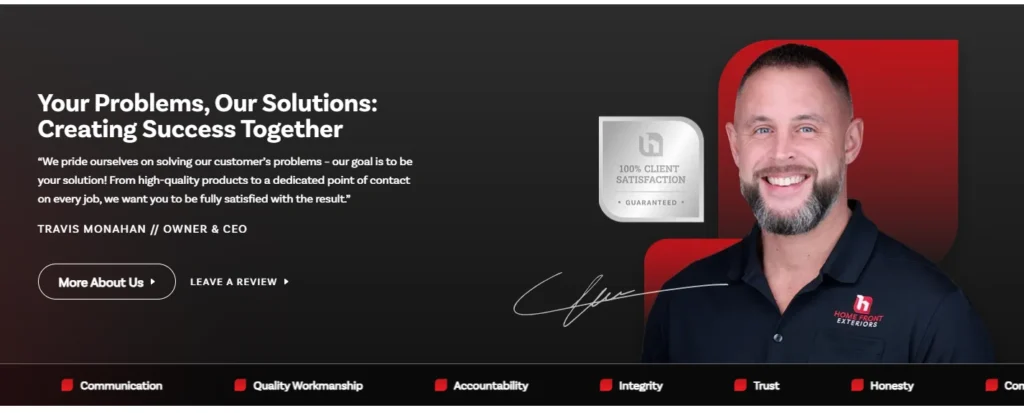
We both know it’s easier to sell in person. When you shake someone’s hand, make eye contact, and talk about their project, they can catch your vibe and trust is built quickly. The goal of your landing page is to do the exact same thing, without the handshake.
People buy from people they like, know, and trust.
That’s why showcasing yourself or your crew on your website is powerful. Add real photos. A behind-the-scenes look at your team on the job. It doesn’t have to be fancy, it just has to be real.
You’re not just selling a service; you’re selling confidence that the job will be done right. A friendly face builds connection, shows professionalism, and reminds them there’s a real human behind the screen who gives a damn.
PRO TIP:
Skip the stock photos. Use actual photos of you and your crew, smiling, working, and showing pride in your craft.
showcase Real Photos of your projects to inspire
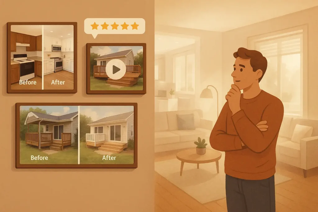
One of the most powerful conversion tools is a gallery of your actual work. It doesn’t just show what you’re capable of, it inspires your visitors to picture your work in their own home.
A homeowner looking to build a deck or remodel their kitchen wants to see themselves in the results. Great images and videos make that possible.
Here’s what to include:
Before/after shots
High Quality Photos
A walkthrough video of a finished project
Short video testimonials from real clients
You’re not just showing your work, you’re inspiring your website visitor to reach out by showing them what could be possible in their own home.
PRO TIP:
Showcase your best work first! Even if you’re just starting out, 3-4 high quality photos will do the trick.
Stand Out and prove why you're better than everyone else
Every contractor claims to be “locally owned” or to provide “superior quality.” Those phrases have become so common that they’ve lost meaning, your potential customers hear them everywhere so they don’t help you stand out.
Instead of relying on generic buzzwords, focus on what actually sets you apart from your competitors. This could be:
Special discounts or promotions
A specialized process or technology you use to deliver better results.
Exceptional customer service practices like 24/7 availability or a dedicated project manager.
Proven speed and efficiency — maybe you finish jobs faster without sacrificing quality.
PRO TIP:
Mention any local partnerships, or charity work. Being active in the community builds trust and makes you more relatable to local customers and sets you apart as a contractor who truly cares about the people you serve.
Show Your Process So They Know What to Expect
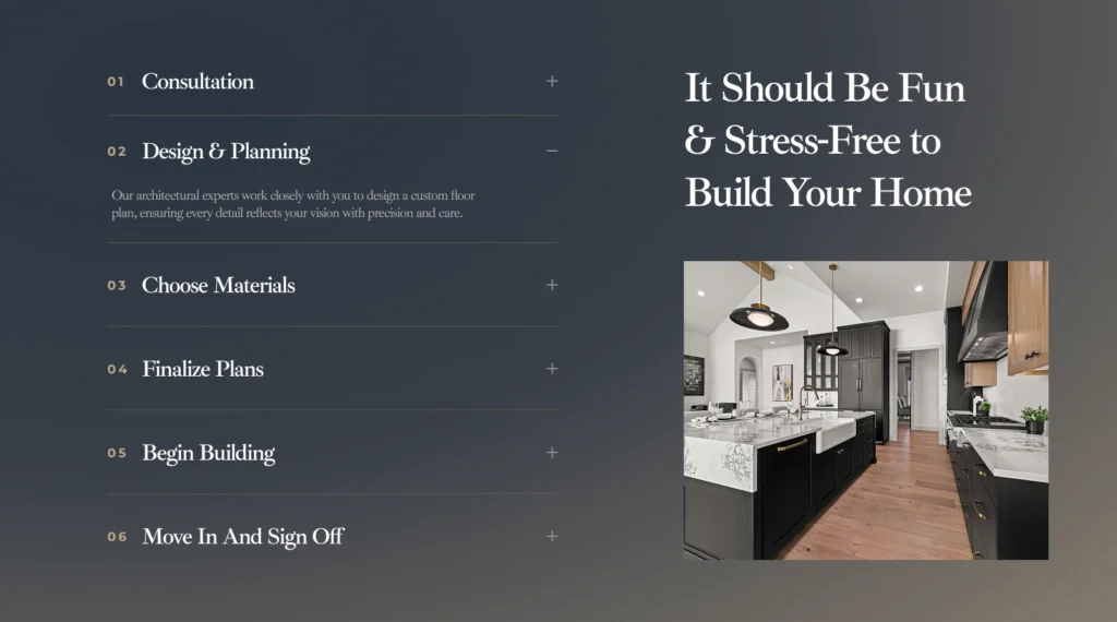
Let’s say someone trusts you, they love your work, and they want what you offer, but it’s their first time doing a home improvement project. That means they’re probably wondering: “What happens next?”
Adding a simple “How It Works” or “Our Process” section helps eliminate that uncertainty. When visitors understand the steps—from the initial quote to final walkthrough—they feel more confident and comfortable reaching out.
A basic 3- to 5-step visual can do the job:
Get a Free Quote
We Visit Your Site
You Get a Detailed Plan
We Build
You Enjoy Your New Space
Clarity builds confidence—and confident visitors are more likely to become leads.
PRO TIP:
Include estimated timelines for each step of your process. (e.g. “Step 2: On-site visit within 48 hours”)
remove any last Objections with a FAQ Section
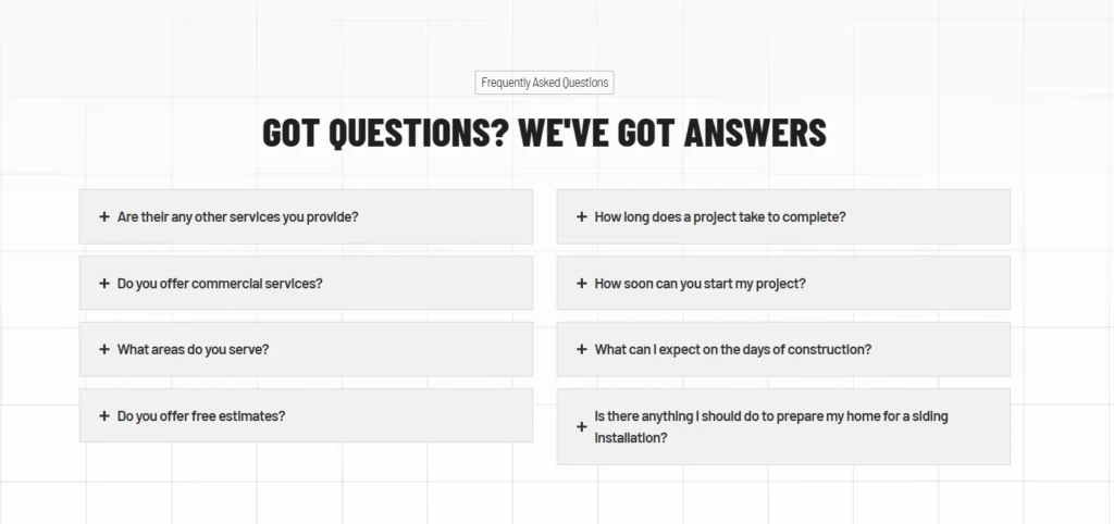
Even if your landing page is solid, some visitors will still hesitate. They might have a deadline, wonder how soon you can start, or need more clarity on your process before reaching out.
That’s where a short, well-crafted FAQ section at the bottom of your page can make all the difference.
Address common concerns like:
How fast can you start?
What areas do you serve?
How long will the project take?
Do you offer free estimates or warranties?
By answering these upfront, you remove friction and give visitors the confidence they need to take the next step.
PRO TIP:
Not only does this remove friction, this can also save you some time so you don’t have to keep answering the same questions over and over.
Final Thoughts:
Your landing page is your closer
You can run the best Google Ads in your market, but if your landing page doesn’t back it up, you’re just wasting your ad spend. A well-built landing page isn’t just a place to send traffic, it’s your closer, your sales pitch, and often the first impression a potential customer gets of your business.
Don’t waste your ad spend sending clicks to a page that doesn’t convert.
Want quality leads on autopilot Without Wasting Hours Learning Ads?
We’ll build and manage your Google PPC campaign so you don’t have to.

All Rights Reserved. The imitation, duplication, and or copy of any of our media as a representation of your own is a criminal offense and will be prosecuted.
